Sunday, 13 March 2016

Technical Session: Advanced Plaiting

During this technical session with Lottie we looked at advanced plaiting as part of the unit in fashion. I really enjoyed this lesson as I think braiding will be really helpful when coming up with my looks as braids seem to be a key trend for spring summer in the fashion world. 

Product List: 
Comb
Paddle Brush
Little elastics
Sectioning clips
Hairspray

5 Strand & 8 Strand & 11 Strand Plaits


For a 5 stand plait firstly you divide a section of hair into 5 separate sections and begin to cross over the hair. Label the 5 strands from left to right 1, 2, 3, 4, 5. Start with strands 4 and 5 and firstly go over 4 and then take 4 over 3. Take 1 over 2 and 2 under 3. Repeat these steps until you have completed a 5 strand plait.


For an 8 strand plait, begin by separating into three sections another section of hair. Begin by plaiting and after each plait thread through the third strand into the 5 strand braid, making an 8 strand braid. 

To make an 11 strand braid repeat the steps of an 8 strand but on the opposite side. 


The next advanced plaiting is a dutch braid. The best way to explain how to do this is to do an opposite french braid. Start by taking three strands and start to braid instead of going over go under with the hand movements. 


The next braids are waterfall and ladder, they go hand in hand. This one I think is the prettiest and something I see myself using a lot. Firstly what you do is you begin by taking three sections as if you were going to start a normal braid. As you begin to plait, plait twice and drop the third strand and pass it to your model to hold, repeat this step and finish with a normal plait. To create the ladder plait firstly use the first waterfall braid you created and using the dropped down strands to make a ladder shape and just plait like you normally would. 

waterfall braid


ladder braid


Overall advanced plaiting was hard for me, but I know that I will be able to create them slightly more neat with practice and if I have learnt anything from doing hair and make-up it's practice is vital. 


Technical Sessions: Eyeshapes and Liner

In this practical session with Fenella we looked at different eye shapes and liner. I wanted to do something typically different then practising a normal gel liner and Fenella agreed, I showed her the image I wanted to create. 


Products used: 
Mac Paint Pot in Soft Ochre 
Translucent Powder
Urban decay Naked Palette
Loreal Felt tip Liner
Black Glitter
Dip brow Pomade - Medium Brown
Black Mascara 
Naked Foundation - Urban Decay 
Mac Pro long wear concealer NC15 for highlight
Mary Louminzer highlighter
Hoola by Benefit for contour
Rosy Pink Lipstick from Smashbox palette


 Method:
I started by carving out the crease and elongating it to creating the deep dark shape. I started on the eyes instead of doing the base because as I was working with dark shadows I didn't want the fall out to ruin the dewy base underneath. I was happy that  freehanded this crease without any tape, it showed me that my skills are improving every time I push myself. I then went on and added a small amount of dark shadows each time blending as I went. I then took some more shadow on an angled brush and map out the liner of this look. I winged it upwards until it met black crease. I then went over this with Loreal felt tip liner to darken this. I applied a highlighting shade from the palette upon the lid and under the  brow bone to highlight this. Moving on I took some Mac mixing medium and lightly mixed it with glitter, I applied this delicately over the top of my crease. I then curled the lashes and applied lashings off mascara (I wish I had brought my false lashes to use this day as I think it would have completed this look). 
Moving onto the base, after letting moisturiser and oil sink in I applied a light coating of Naked skin foundation with damp sponge all over my models face down her neck and her ears (being extra careful when working round the eyes). I then highlighted the skin with a concealer that was 2 shades lighter then my models skin tone, across the cheekbones, down the nose, under the jaw and on the bottom of the forehead. I used a little powder in just the extra oily areas to set. I then dampened my brush and foiled powder highlighter on the high points of the face I finished with a rose colour on the lips. 

Evaluation:
I love how this look turned out, I might even use something similar when it comes to shooting one of my looks. Just incorporate the SS theme into it somehow, maybe using different colours. If I could changed something it would be try this look on a different model, perhaps one with deeper set eyes. 

Thursday, 10 March 2016

Presentation of ideas

For this unit we were briefed with the task of presenting our initial ideas to our peers and Kat. As this was informal and I felt I already had a clear understanding of what the brief was, I wasn't nervous to present my ideas. The presentation time allocated was 10 minutes and we had to discuss what the 5 p's of our chosen brand, our ideas for the 6 shoots or what we had so far with regards to styling, make up and hair and the location. 

With one minor technical glitch concerning my power point presentation not working correctly, I feel as if I managed to talk about my ideas and brand for the time allocated, with the feedback from Kat and my peers I feel as if I can now go on further my ideas and begin to shoot. 


Wednesday, 9 March 2016

Technical Sessions: Assessment look development 'The Catwalk Look' no.4

Palette I used as inspiration.

At last I finally feel like I am progressing with my assessment look. I went home and started to look into this technique of paint splattering  by doing some internet research and looking at something I could use to link the look back to the bran Yves Saint Laurent itself. 

After going back over the collection once again I was really drawn to the beautiful packaging from the spring collection from this year, being drawn to the palettes from the collection, the marble look really stuck out to me and I started to think about how I could pull this packing into a make-up look. As the packaging is a marble type of look with gold hardware, I looked at people on the internet that had created something inspired by marble...the results were poor and it was mainly more to do with nails. 


I then decided to look back over my past designs and look at what I had already created to see what I could develop. Now I loved the fact that I had used a paint splatter effect on the previous look but I thought how I could use this in a fashion sense whilst incorporating this beautiful packaging.

I started to look at the colours in the predominantly green packaging and saw that it is built up with white, greens, yellow and small blue tinge running throughout. And by then I had come up with my idea, I was going to create a paint splatter effect across my models face hoping it would create the closest marble effect in make-up that I could think of. 


In Kat's lesson I practised on my model Jamie (who I am using for the assessment) I firstly created a dewy base using a range of products such as moisturisers, glow creams, oils, powder highlighters and a light coverage of foundation, concealer and powder across the t-zone. I kept the brows very basic with a small amount of dip brow pomade by the brand Anastasia Beverly Hills to create a shape and then just brushed them upwards.I took two of the trends from the current season of make-up and catwalk of dewy skin and natural brows as I was going to create quite a dramatic look with the paint splatters. I applied a few individual lashes to my model just to create a natural but fluttery look. 


Moving onto the paint splatter section of the make-up I used two small shaped fan brushes, one slightly bigger and one slightly smaller and used green and white paints. I was using a reference picture of the palette from the collection to try and create a similar type of pattern. Overall I love how this turned out considering I was so content on focusing on the eyes for this look. Unfortunately I am still stuck on hair but I think I will pick something that doesn't deters to much from the make-up so maybe something slicked back. Something I can complete in good time for the assessment as I think the make-up might take me a fair amount of time. I really want to perfect the base underneath. 


After some feedback by Kat she agree that if I created this look with toothbrushes instead the paint would splatter a lot nicer and heavier and the camera would pick it up better. I totally agree with this and am going to try this with another practice to get my final look. 

To be honest with myself I know something is off about this look and I know I am 100% happy the more I critique myself. I know I like where this idea is going and I know its missing something, it's just a matter of finding out what that is. I think my best move from right now is to look at expanding this even more and perhaps looking into how I  can focus this more on a fashion look. I still feel like it has a beauty element to it. I think it looks to pretty and not as artistic as I would like it to look. 


Friday, 4 March 2016

Saint Laurent Editorials


http://www.fashiongonerogue.com/wp-content/uploads/2015/10/Saint-Laurent-Spring-2016-Details05.jpg


http://www.fashiongonerogue.com/wp-content/uploads/2015/10/Saint-Laurent-Spring-2016-Details09.jpg


http://cdn.thefashionography.com/wp-content/uploads/2015/12/saint-laurent-ss-2016-hedi-slimane-1.jpg

http://www.worn.cz/public/files/0c7/199605-Ruth-Bell-Saint-Laurent-Cruise-2016-Campaign01.jpg
http://www.fashiongonerogue.com/wp-content/uploads/2015/10/Saint-Laurent-Spring-2016-Details10.jpg


http://www.fashiongonerogue.com/wp-content/uploads/2015/10/Saint-Laurent-Spring-2016-Details06.jpg

I have many ideas when it comes to setting out my editorial pictures that I'm struggling to narrow it down. I think overall the pictures will be shown separate when it comes to submission but for the sake of this blog and for my own enjoyment I would love to set this out in a magazine format, which includes a front cover, the 2 advertisements, the 2+  editorial spreads (I am having trouble narrowing it down) and a page which is made up of backstage pictures of the YSL spring summer 2016 fashion show I am trying to incorporate, including the products used, and tips and tricks how the looks were created.


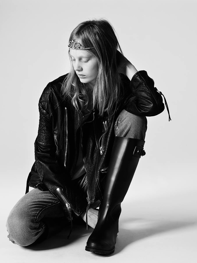
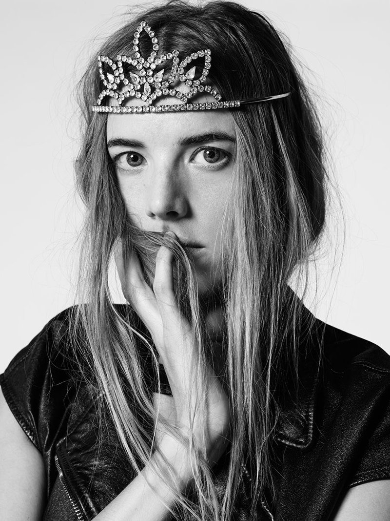
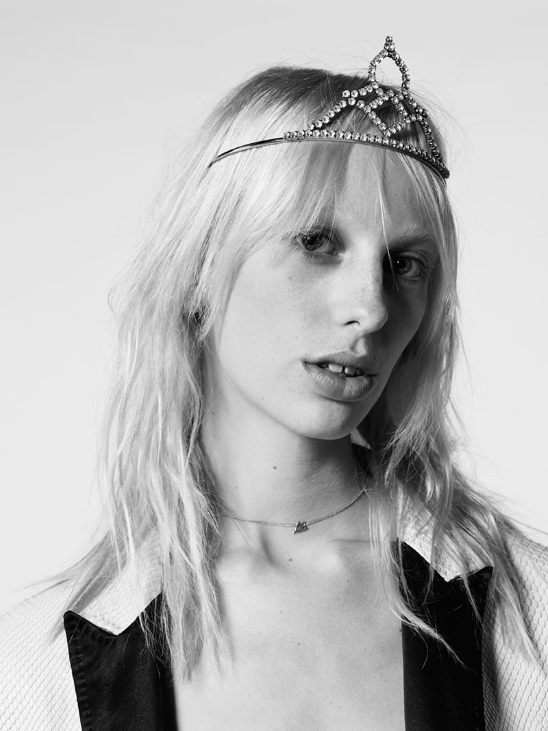
I love the way Saint Laurent lay out their editorials because I think they are straight to the point, as they are selling clothes and the lifestyle of Saint Laurent they don't need anything fancy just making sure the name is visible and to the point. 

For research purposes I looked into the standard YSL theme they use when they create editorials. The last few years the brand itself has used a black and white image normally quite grungy and hipster looking with a plain white block of colour with the name 'Saint Laurent'. 


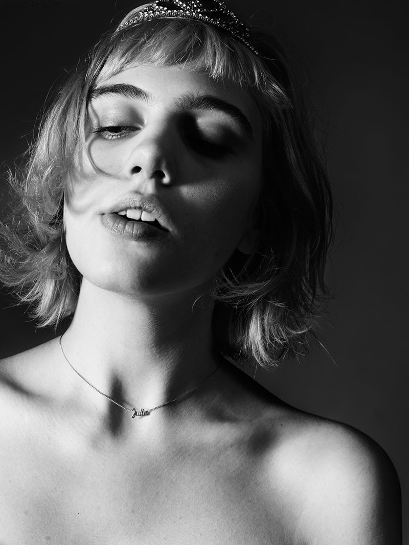
I also really like these portrait shots used in an editorial style because I know I want one editorial to involve more of a feminine approach then a grunge approach and I belive just a straight forward black and white portrait shot would look best for a more feminine ideal. 

Wednesday, 2 March 2016

Technical Sessions: Assessment look development 'The Catwalk Look' no.3

I took a 10 minute chance in the studio to attempt the development of my idea for my assessment and one of my catwalk looks. I knew from the last time I wanted to carry on using these colours but I had found images during my research the night previous of a make-up artist who used a speckled look on her eyes. 

The artist is called RISADEXTER and I just love these looks, they have given me some real inspiration to create my looks. 


I used a mixture of splatter techniques with fan brushes and using a very small detailed brush to create small dots over my look. I used aqua colour for this as I thought mixing it with a larger ratio of water will allow it to splatter better then supra colour or eye-shadow with a mixing medium. As this was only 10 minutes set aside to develop my ideas, I didn't have time to attempt skin, eyebrows or lips but I am starting to get some where I feel in terms of development within my ideas. I think my next step will be to try something that steps away from the eyes and maybe I'll find what I'm looking for and will be able to come up with a solid look for my assessment, which is slightly dawning on me quicker then I would have liked. 


Tuesday, 1 March 2016

Technical Sessions: Hair Accessories and Chignon

I wanted to create something that was pretty but quite simple. I think I achieved this. 

Product List:
Paddle Brush
Pin tail comb
Hair grips and pins
Hair bands 
Hairspray 
Tongs

I started by brushing the hair through to take out any tangles. I backcombed the front to create a little volume and left out two small sections near the ears to curl. I took the hair into a loose pony tail and tied it off to finish. I then folded it over and pinned it into place. Taking two pins you bring bot of the sides of the rolled over pony tail and pin them into the hair besides, creating a chignon. To apply hair accessories I took a small piece of jewellery and placed this around the chignon and made sure the pins were hidden underneath. I curled the front sections and finished with hairspray. 


If I was to do this again I would perhaps complicate it more for myself and push my creativity.  I think this style will be really helpful for ay bridal or special occasion make-up I do.