Thursday 31 March 2016

Yves Saint Laurent - Creative Director of Make-up: Lloyd Simmonds


Appointed Yves Saint Laurent's international make up artist back in 2010 and now the Creative Director of make- up, Lloyd Simmonds is responsible for creating some of YSL Beaute's current hero products such as the new formula of Touche Éclat as well as creating the new shades so all women can wear the product not just your typical Caucasian women. Another product Simmonds is the mastermind behind is the shocking mascara. This is a mascara that could prefrebly reach a younger market as it focuses mainly on the volume of the lashes, creating dark and defined statement lashes. 

Lloyd describes the Ideal YSL women as women who are in control, strong and sexy. The models that used to walk the catwalks back in the day. Since Heidi took over the creative direction of the brand the ideal women has technically changed to reach a wider target audience for the brand. With now a more edgier look being proposed through the catwalks and editorials. Simmonds wanted to create choice once again appealing the brand to everyone. 


http://www.vogue.co.uk/beauty/2011/11/14/lloyd-simmonds-ysl-beauty

Tuesday 29 March 2016

Spring/Summer 2016 make up and hair trends


Noticeably the trends kind of repeat themselves most years in fashion just with new and different twists. 

This year separated lashes, created with mascara or lashes has seemed to be a big influence on catwalks this past year. 
The hippy doll-like beauty was achieved at Louis Vuitton with an exaggerated lash look and miniature plaits woven into the models' long locks. Channel this come festival season.
Louis Vuitton SS 16 
 Slicked back hair is something again that has made more than one appearance over the fashion weeks. 

DSquared2 confirmed fashion's obsession with wet-look locks, depicting "sexy surfer girls". Layered up with L'Oreal products, hairstylist Sam McKnight ran a wide-tooth comb through the lengths to create grooves. The MAC makeup centred on dewy highlights with clear Lipglass applied to the lips and combed through the brows.
DSquared ss 16

Braids made many shows this time around, all different, some simple and some extreme, but the brands stereotypically seemed to either focus on hair or make up - something I have noticed across fashion. 

Antonio Corral Calero, Global Moroccanoil Ambassador, created these enchanting multi-braided hairstyles. The two braids at either side of the models head overlapped at the back and were secured by knotting the hair four times, with the ends left loosely hanging.
Kristin Aadnevik ss 16
Dewy and bronzed skin again made a seasonal appearance within fashion week. Healthy, glossy and fabulous
St Tropez set the 'sand-swept' trend at House of Holland, with a matte tan replacing makeup. To achieve the look Jules Heptonstall, St Tropez Tanning Expert, prepped the models' skin with two coats of Instant Tan (in Light/Medium) and added a dusty finish with their Powder Bronzer Matte product.
House of Holland SS 16

Another staple colour the brands seem to want in there looks is blue. Royal blues mainly which are normally focused around the eyes, smudged to create a more playful grunge look. 


Francois Nars, Founder and Creative Director of New York Fashion Week's big beauty player described the beauty look at Marc Jacobs as depicting "the East Village girl who's been out all night". Hungover party makeup? Easy. They key is "too much mascara", try NARS Audacious and smudges of blue eye shadow in the inner corners. The hair mirrored the trend with a grungy disheveled chignon.
Marc Jacobs SS 16 (Make-up by Nars)

Brands seem to have carried on this liner trend with using the techniques of GRAPHIC LINER and concentrating something more editorial on the eye. 

Makeup legend and Covergirl Global Creative Director Pat McGrath set a trend for deep red lips in Spring. Well, why not? "Makeup is different now, you do what you want and you're not dictated by seasons," she said backstage. Gigi Hadid demonstrated this well. Her beach waves were adorned with Tahitian-inspired wreaths for the ultimate beauty look inspired by the tropics.
Anna Sui SS 16

Another way fashion has used graphic liner is by taking inspiration from graphic art and creating a look on the eye using one one wash of messily applied shadow or cream to the lid. I personally love it. 

Inspired by abstract art, makeup maestro and Shiseido Artistic Director Dick Page painted a "smudge" on the models' eyelids at the Zero + Maria Cornejo show in New York. Using jagged brush strokes he applied a white cream pigment to the peepers. We love this look against a strong brow (although we'd add mascara!).
Zero + Maria Cornejo SS 16

Looking at certain trends for the spring and summer time featured in magazines such as vogue and cosmopolitan really helps me grasp of what is used and expected during the season. I think I am going to look into incorporating a dewy skin and a graphic eye of some description and as I think this is what most would describe my brand YSL and myself as a designer. Keeping with the brand and how they influence their collections I also want to throw something into my designs that is my own and a twist not something that perhaps has been done before. 

A piece of Yves Saint Laurent History


During my research for the brand Yves Saint Laurent and in looking for research to back up my initial ideas, I wanted to look closely into past advertisement and editorial spreads created by the brand and how they have changed and developed since the brand was first launched. 


Some advertisements by YSL have been that risqué that they have been banned from being used on billboards etc. The brand itself is known for sexy, sophisticated images and clothes trying to interoperate the modern women. 

Here is some of the Advertisements Yves Saint Laurent have created and used in the last 50 years. 

This is an advert for the scent Rive Gauche. This has a very oriental style just like the scent Opium. 

Editorial advertisement image for the brand in 2010. 

Another advert featuring spring colours of pinks and lilacs, very spring time appropriate. Doesn't tie in well with the scents packaging of blue, black and silver. 

Something different for the brand, but still keeping within their sexy feel. 

2010 editorial for the brand, including the theme of black and white. This is used a lot in the brands editorial shots. 

One of the first adverts for the scene OPIUM. 1977 Oriental feel and well known model Jerry Hall as the face. 

This advertisement is quite different to the usual YSL theme of adverts, very floral and summery. 

Karlie Kloss modelling for the brands beauty label in 2010. Another well known model. 

Model Kate Moss modelling for the brands best selling fragrrance Opium. The brand seems to use well known faces for the scents advertising campaign, trying to reach a younger audience with this more mature scent. 

80's styling and take for the scent Paris. 

Model Linda Evangelist modelling for the fragrance Opium, 

Linda Evangelist modelling for the fragrance Opium. 

Opium is YSL's most famous fragrance for women and has an almost oriental feel about it. 

This advert featured  the creator himself and is one of the first, promoting a the first fragrance of the brand. 

This ad features super model Naomi Campbell, from this it's clear that the brand likes to use models with high followings at the time. 

This type of style YSL created is something that I have taken my main inspiration from. The dark clothing and sophisticated poses.  

This advertisement from the 90's shows the typical YSL man. Class and colour. 

Model of the 80's Iman models for the brand. 

A more modern take on the beauty adverts by the brand. 

Super Model Kate Moss models back in 2009 for Yves Saint Laurent Fragrance Parisienne. 

Overall I have enjoyed looking at these images as I believe they will really help me with coming up with my own images for this unit. Personally I believe I am on the right track towards creating something that uses the same ethos as the brand itself. 

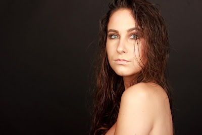
Shoot No.4 Editorial Look 2

I am so proud and happy by this piece of work I have made. I love how this idea has come together and I know I will use this image throughout my portfolio for years to come. The styling was kept minimum, I tried a few shots with the jacket I had used before but I preferred just skin, it was a lot more raw and sexy. The hair was just literally styled with water and I had my model tip her head forward so I could get it too look as natural as possible. The make-up was dewy and bronzed as I wanted to create a stereotypical summer look to follow the brief. 

This shoot went very well on the ay, I finished with time to spare and came out wit se beautiful images. As it stands there is really nothing I would change in terms my design, photoshoot or postproduction.